Portfolio
Personal Work
Summer 2008
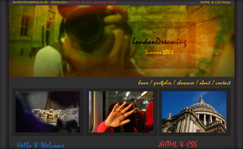
While looking through my own photography, I stumbled upon the photo that I've used in the header (top image). It captured my summer of 2008, a period when my sister got married , a time spent guiding overseas relatives around London while snapping away.
The original header image was a little gloomy, so I used Curves in Photoshop to bring out the warmer holiday tones. I also kept the image quite large in order to arrest a visitor's attention. Originally, the three smaller photos had the same effect as the main one. However, I felt that this didn't help guide a user's eye so I removed the effect, making the images more prominent, causing the eye to follow down the page.
The header image helped define the colour scheme for the rest of the page and I went with a dark, neutral, background so that the images would really pop. Initially, the colour scheme was red and yellow, on grey. However, I came across the photo of St Paul's cathedral and the blue sky really held my attention. I decided I liked the way the blue complimented the other colours and introduced it.
Finally, I kept the body text in grey because when it was coloured it made the page seem too busy. I went with the Mistral typeface which supported the holiday atmosphere. However, I wouldn't use it as judiciously (especially for the menus) for commercial projects because some people find it difficult to read.
My Personal Work consists of practice examples & experiments, designed to showcase abilties I may not have used in my commercial work.